Platform Experience Enhancement — Dashboard & Extension
Smoother landing, faster dashboard, and a Chrome extension that brings the platform to the user.
- Role
- Solo Frontend Developer — landing, dashboard UX & extension
- Timeline
- Mar 2022 — Jan 2023
- Team
- Solo freelance engagement
- Status
- Delivered
Overview
What this project is about
The platform worked, but getting users to their “aha moment” took too long: the landing page did not communicate value quickly, the dashboard buried everyday actions, and users constantly tabbed away from their workflow to use the product.
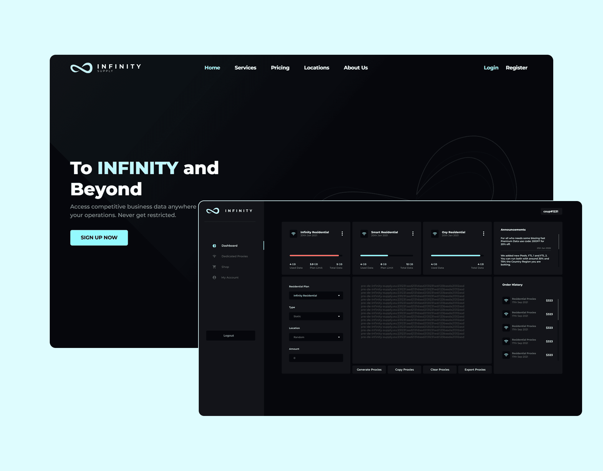
I delivered a frontend-focused enhancement pass: a responsive landing page that funnels visitors toward signup, motion and layout refinements across the UI, a dashboard reorganized around the features people actually open daily, and a Chrome extension that surfaces platform functionality wherever the user already is.
Problem
The challenge
Acquisition leaked at the landing page, and retention leaked in the dashboard — the product needed to meet users where they are.
- 01
The landing page was not converting visits into signups or trials.
- 02
Key dashboard features required too many clicks to reach in daily use.
- 03
Static, abrupt UI transitions made the product feel slower than it was.
- 04
Users lived in the browser, but the platform only existed in its own tab.
Approach
How I built it
The key architectural and product decisions, in the order they were made.
Conversion-first landing
Restructured the page around a single narrative — problem, proof, action — with responsive layouts and clear calls to action above and below the fold.
Dashboard task audit
Mapped the most frequent tasks from client input and usage patterns, then promoted them to first-click positions with streamlined navigation and shortcuts.
Motion with intent
Added smooth, purposeful animations for page transitions, loading states, and interactive feedback — tuned to feel fast, never decorative.
Browser-native presence
Built a Chrome extension that exposes core platform actions in a popup and content-script context, cutting the tab-switching tax.
Features
What shipped
Responsive landing page
Mobile-to-desktop layouts engineered around signup conversion with performance budgets respected.
Customized dashboard
Navigation and surfaces reorganized so everyday features are one click away.
Smooth UI animations
Transitions, skeletons, and micro-interactions that make the product feel instant and alive.
Chrome extension
Platform functionality embedded in the browser toolbar with secure session sharing.
Engagement funnel
Landing-to-signup-to-first-action flow designed and instrumented as one journey.
Design consistency pass
Spacing, typography, and component reuse tightened across landing and app surfaces.
Problem solving
Hard parts & trade-offs
Every project has moments where the obvious path breaks. These were the defining ones.
Challenge
Animations can easily make an app feel slower if overused.
Solution
Restricted motion to state changes and feedback, kept durations under 300ms, and honored prefers-reduced-motion for accessibility.
Challenge
The extension needed authenticated access without duplicating login logic.
Solution
Bridged the extension and web session with token-based auth scoped to least privilege, so users sign in once on the web.
Challenge
Dashboard “customization” risked becoming opinionated reshuffling.
Solution
Grounded every move in the task audit agreed with the client, and kept power-user paths reachable even as defaults changed.
Outcomes
What it achieved
Faster
Path to key features
Daily tasks promoted to first-click access across the dashboard.
Responsive
Landing conversion focus
A conversion-structured page replacing the previous brochure layout.
In-browser
Extension presence
Core platform actions available without switching tabs.
Cohesive
Motion language
A consistent, accessible animation system applied across surfaces.
Retrospective
What I took away
Perceived performance is a design material: skeletons and transitions buy real patience during real latency.
Extensions succeed when they do three things well in the toolbar, not when they clone the whole app.
Dashboard redesigns should start from usage frequency, not from aesthetic instinct.